A STUDY IN COLOR
LAYERED Paper, Issue 2 / 2026
Color is not a surface treatment; it is a physical frequency. Long before we consciously process the dimensions of a room, our nervous system reacts to its palette. The hues we choose to live with dictate our spatial perception, regulate our focus, and fundamentally alter our cognitive state. In a modern landscape defined by constant sensory overload, purposeful color becomes a vital architectural tool for well-being.
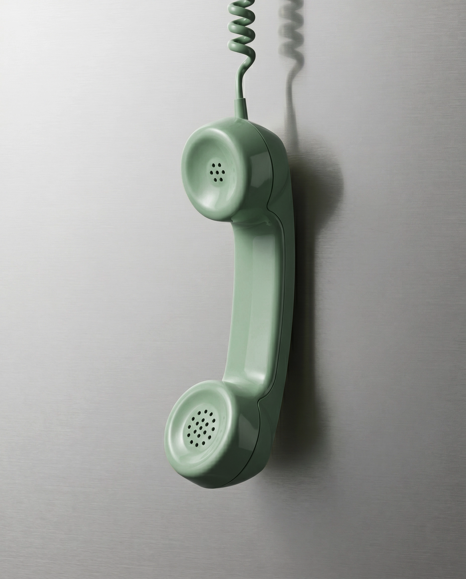
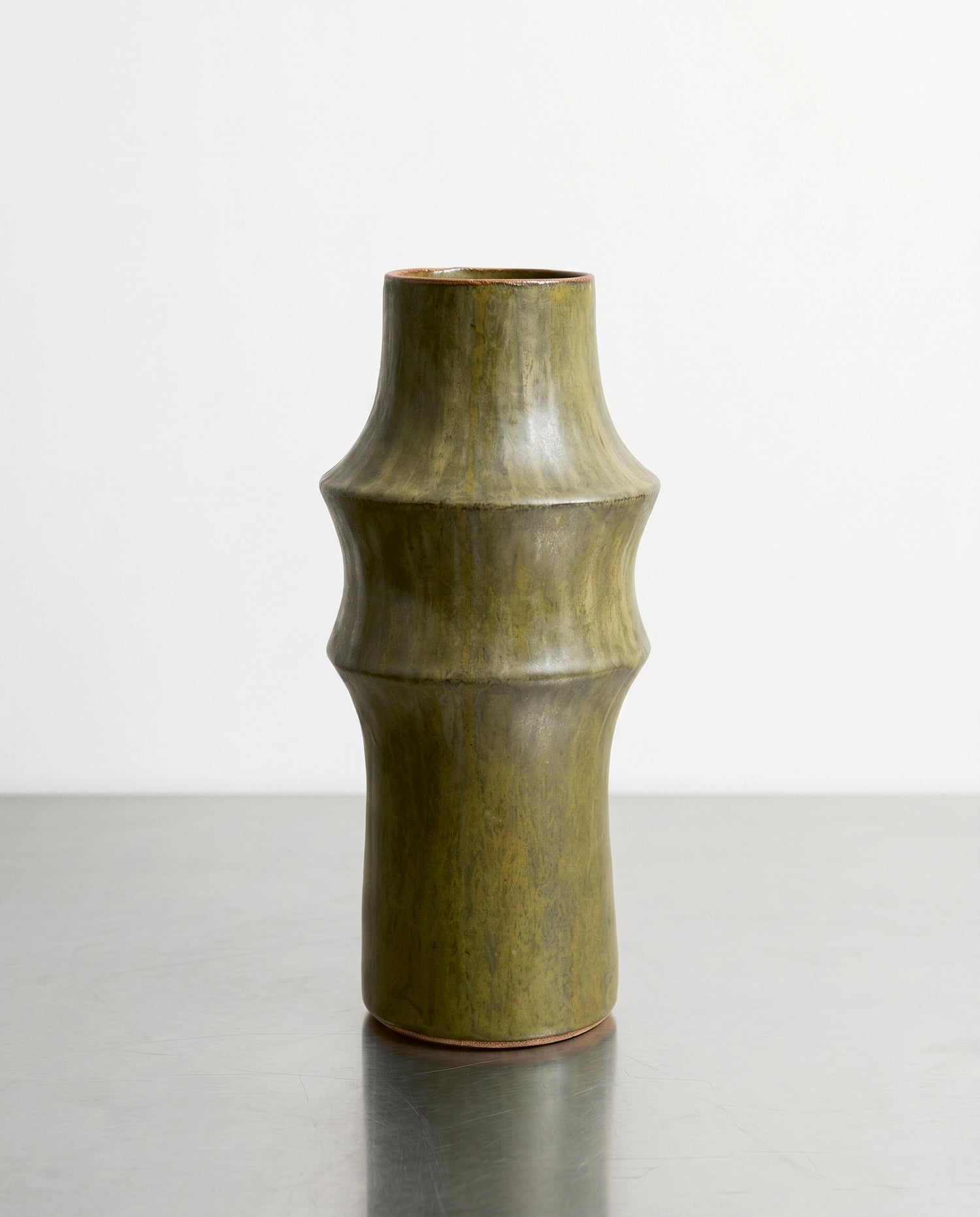
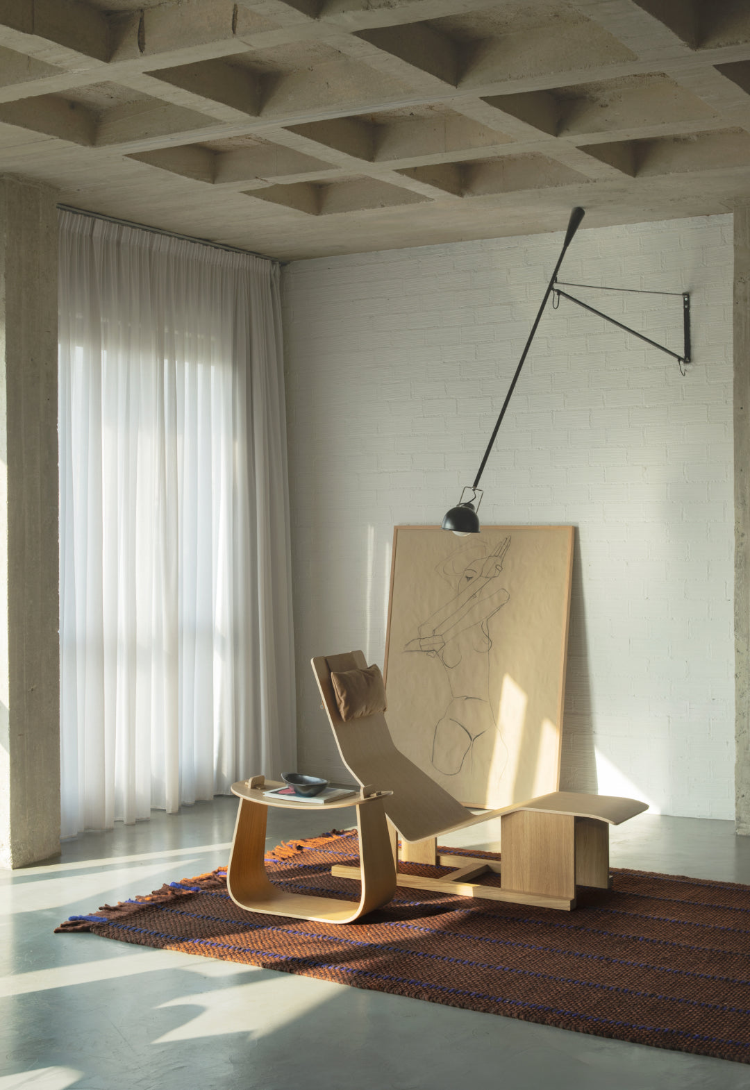
SALVIA does not demand attention; it offers a deliberate visual pause. Rooted in the ancient herb it is named after, its muted grey-green pigments carry a botanical stillness that instantly grounds the mind. We are intuitively drawn to it because it provides a silent, earthy anchor in an increasingly loud world.

Johanna, Sage
"I found I could say things with color and shapes that I couldn't say any other way—things I had no words for."
Georgia O'Keeffe
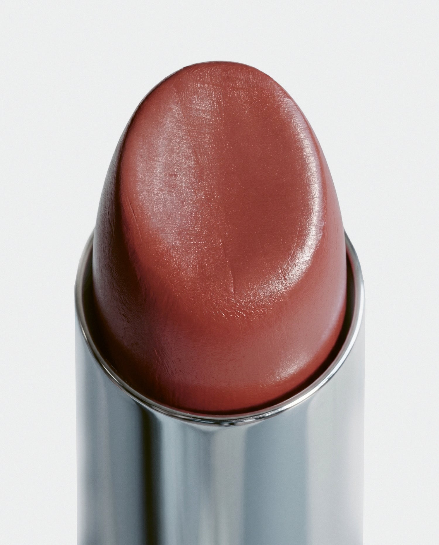
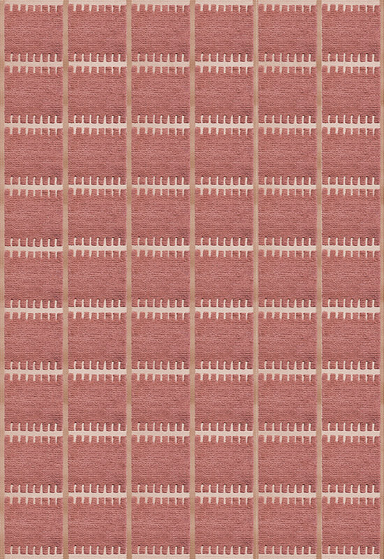
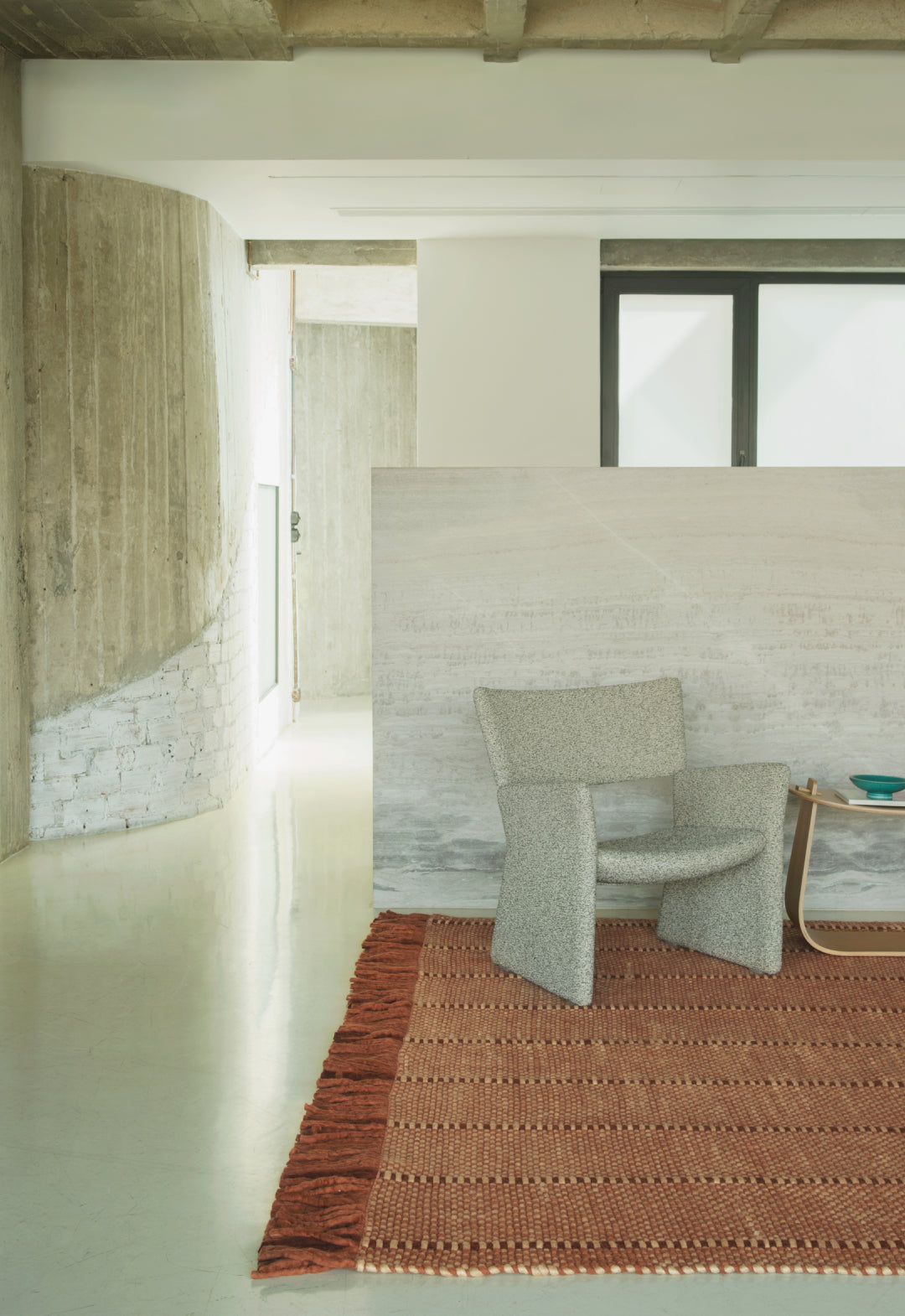
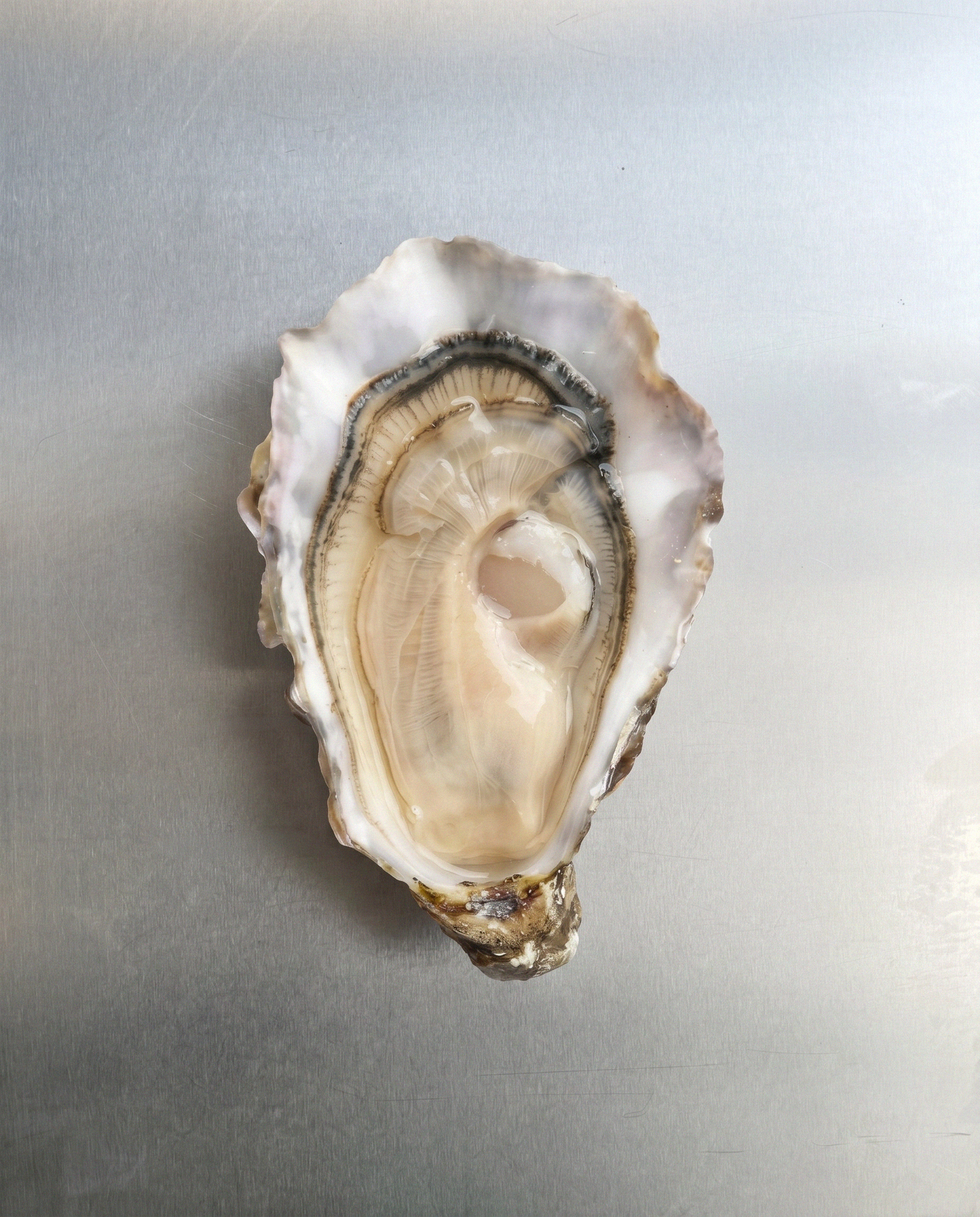
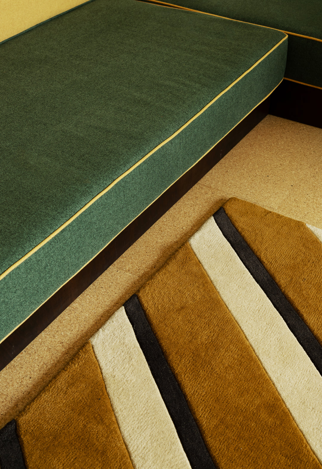
ROSA FRAGMENT This desaturated, dusty rose is not an aggressive presence, but an anchoring one that introduces a tactile, understated warmth. We recognize this aged pigment in sun-baked terracotta, ancient pottery, and the quiet decay of historical frescoes. We are drawn to its sophisticated restraint because it grounds the modern home in a necessary sense of history and time.

Lilly, Claret Red
STOCKHOLMSVIT They say white is the absence of color, when in the physics of light, it is the exact opposite: the simultaneous presence of every visible wavelength. This specific, gently warmed hue—a subtle nod to the classic "Stockholm white" engineered to counter harsh northern light—acts as an architectural tool rather than a passive backdrop. We are drawn to its intellectual charisma because it offers not an empty void, but absolute spatial potential.
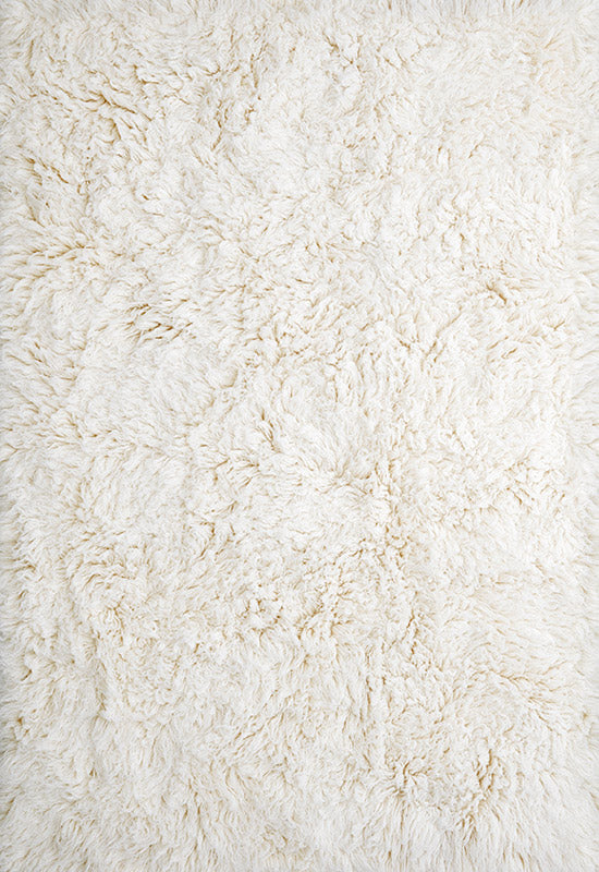
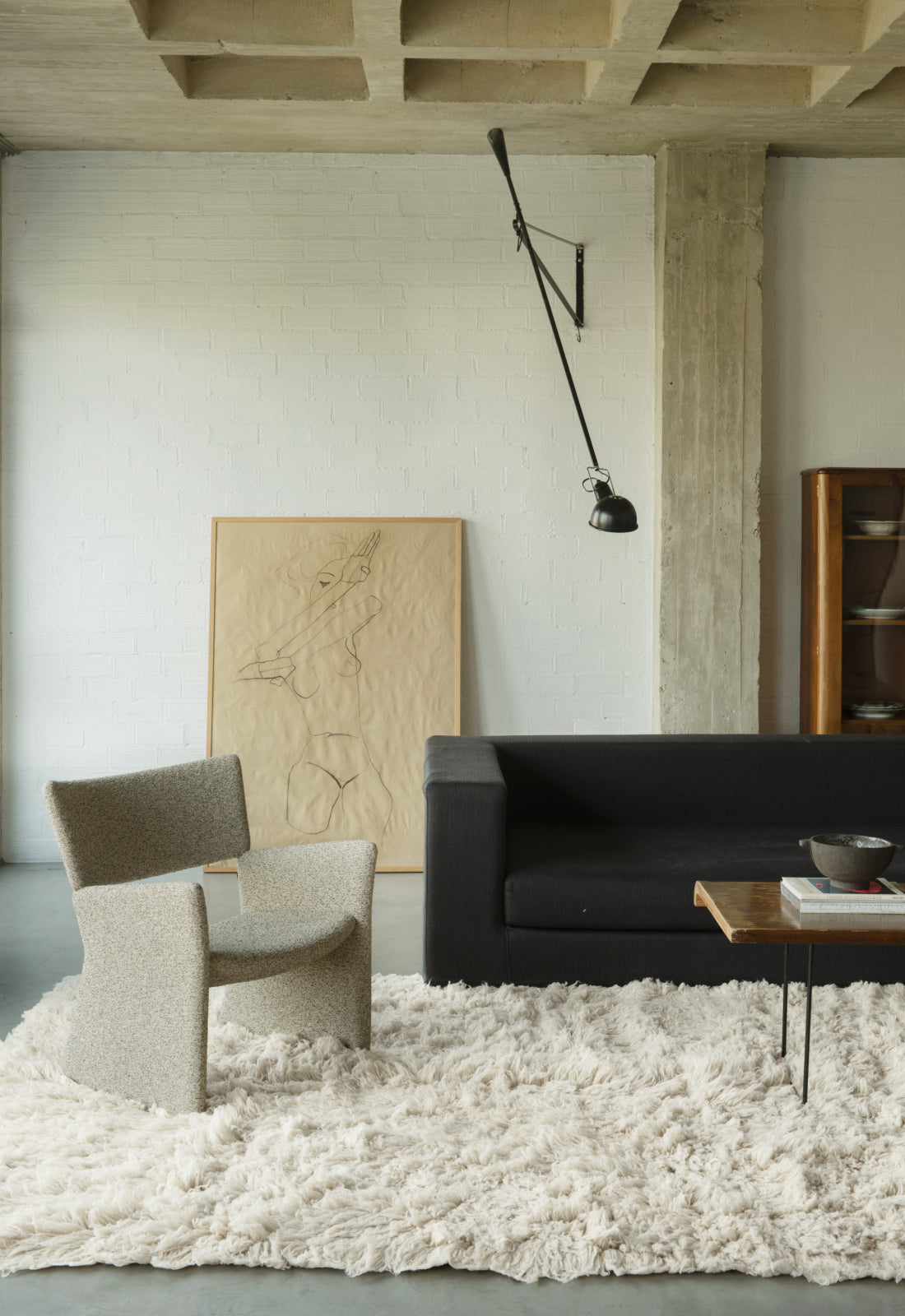
Shaggy, Bone White
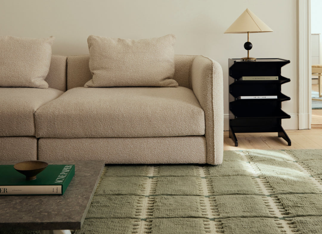
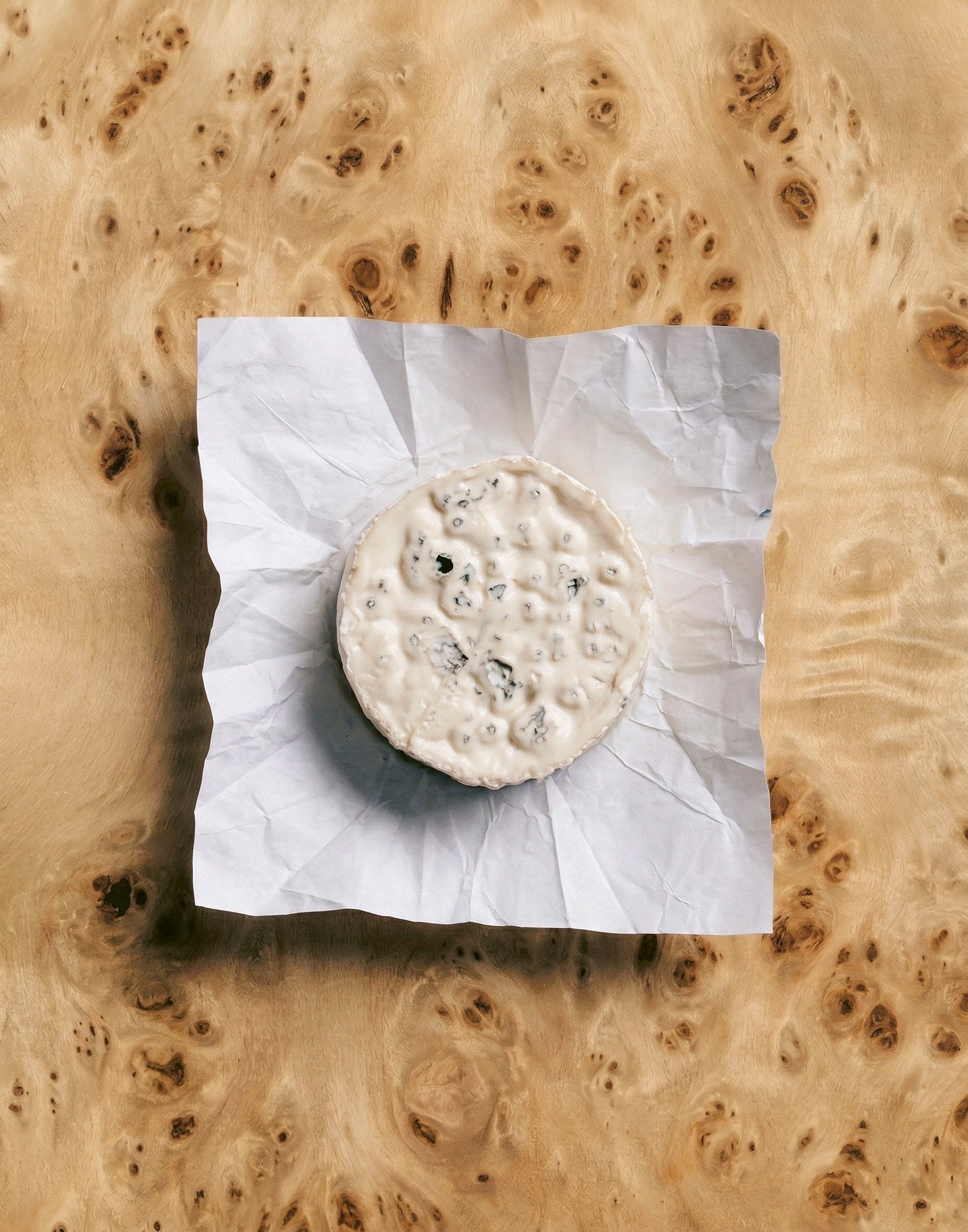
UMBRA The very word umbra translates to shadow—the essential pigment used by classical masters to carve volume out of a flat canvas. In a physical space, this deep earth tone functions exactly the same way, actively absorbing light to create areas of architectural intimacy. Echoing the traditional Japanese philosophy that true beauty thrives in the subtle depths of the dim rather than the brilliantly illuminated, this hue acts as a necessary visual sanctuary.
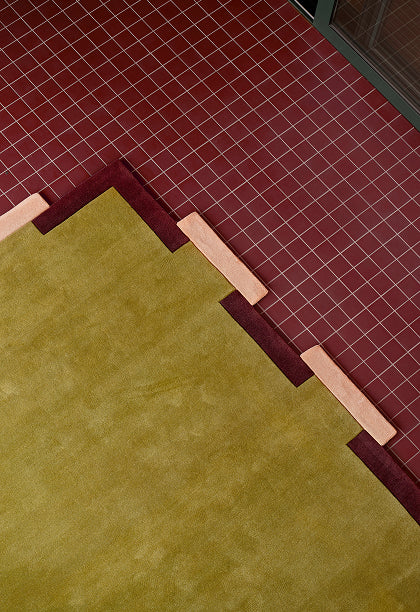
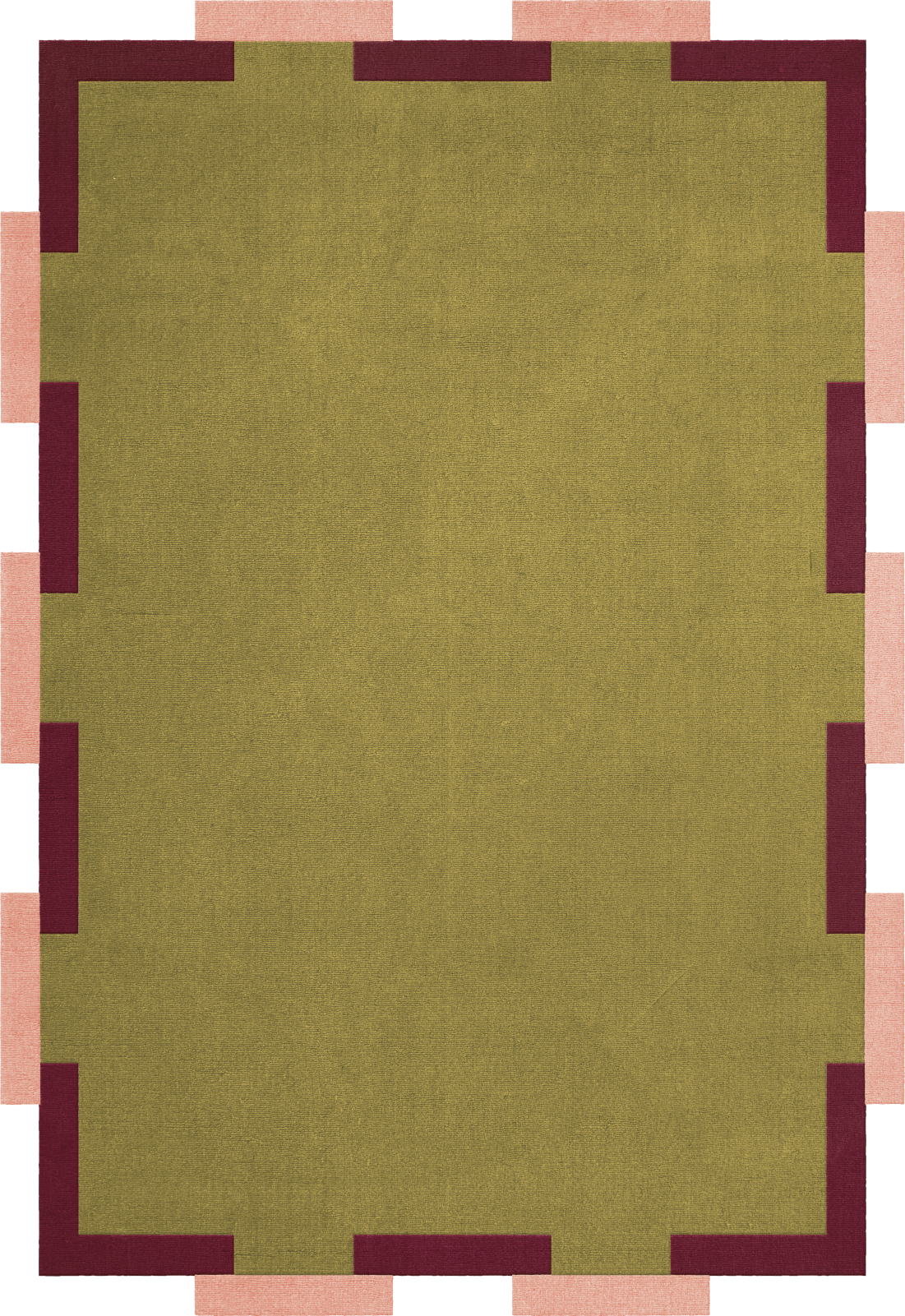
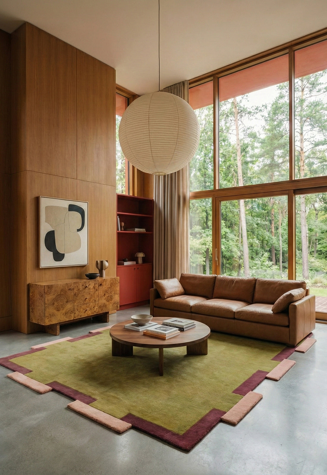
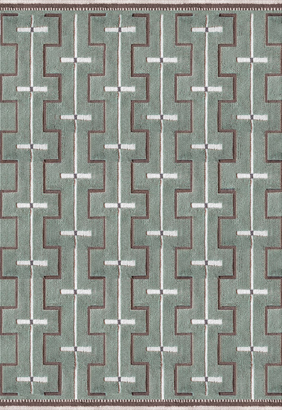
Fregio, Olive Blush
DEN BLÅ While it feels almost mandatory to reference a certain mid-century French artist when faced with this intensely vibrating hue, its powdery depth requires no name-dropping. This highly saturated blue operates not merely as a decorative layer, but as a raw, architectural force. Its radical energy actively commands the room, introducing an immediate sense of gravity and pure, unapologetic clarity.

Solid, Blue Foncè
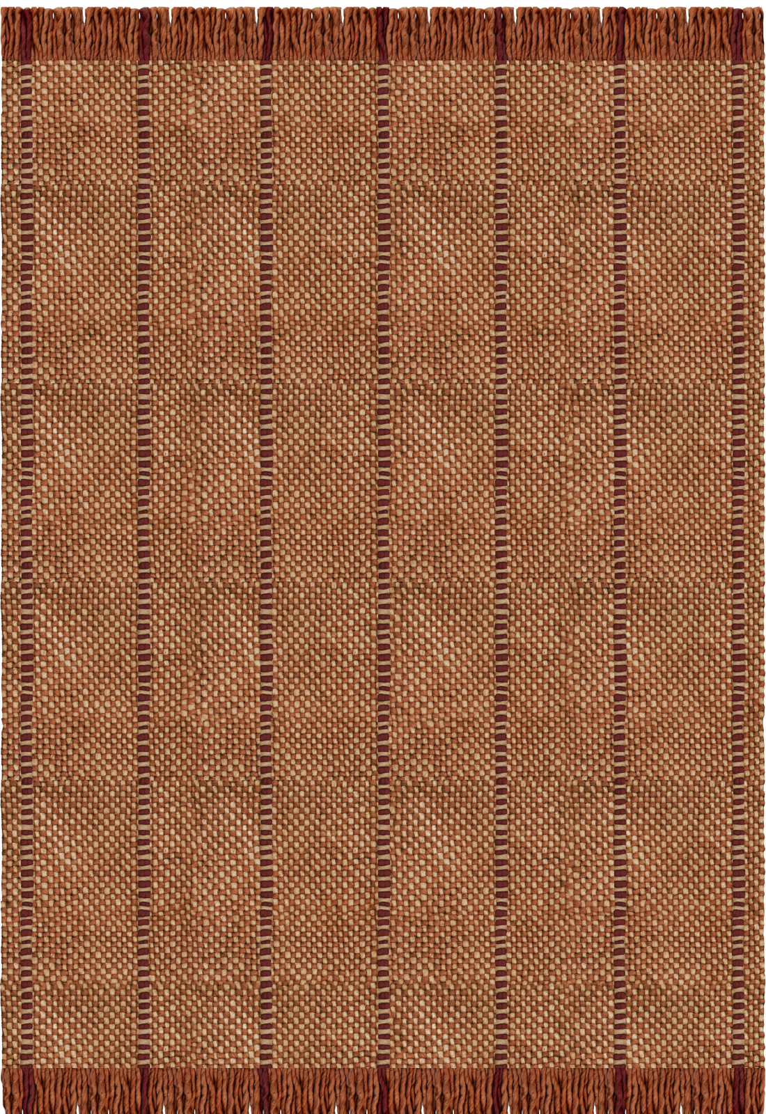
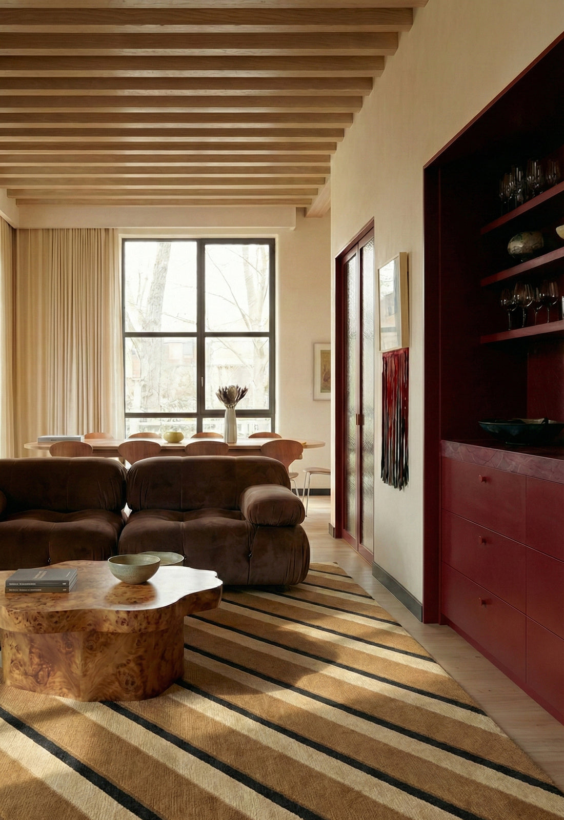
MÖRKROST This deep, roasted brown acts as an active anchor rather than a passive neutral. Echoing the concentrated depth of a dark extraction, it introduces immediate visual focus to a room. It strips away the superfluous, grounding a space with uncompromising, quiet intensity.
Cord, Burgundy Rust
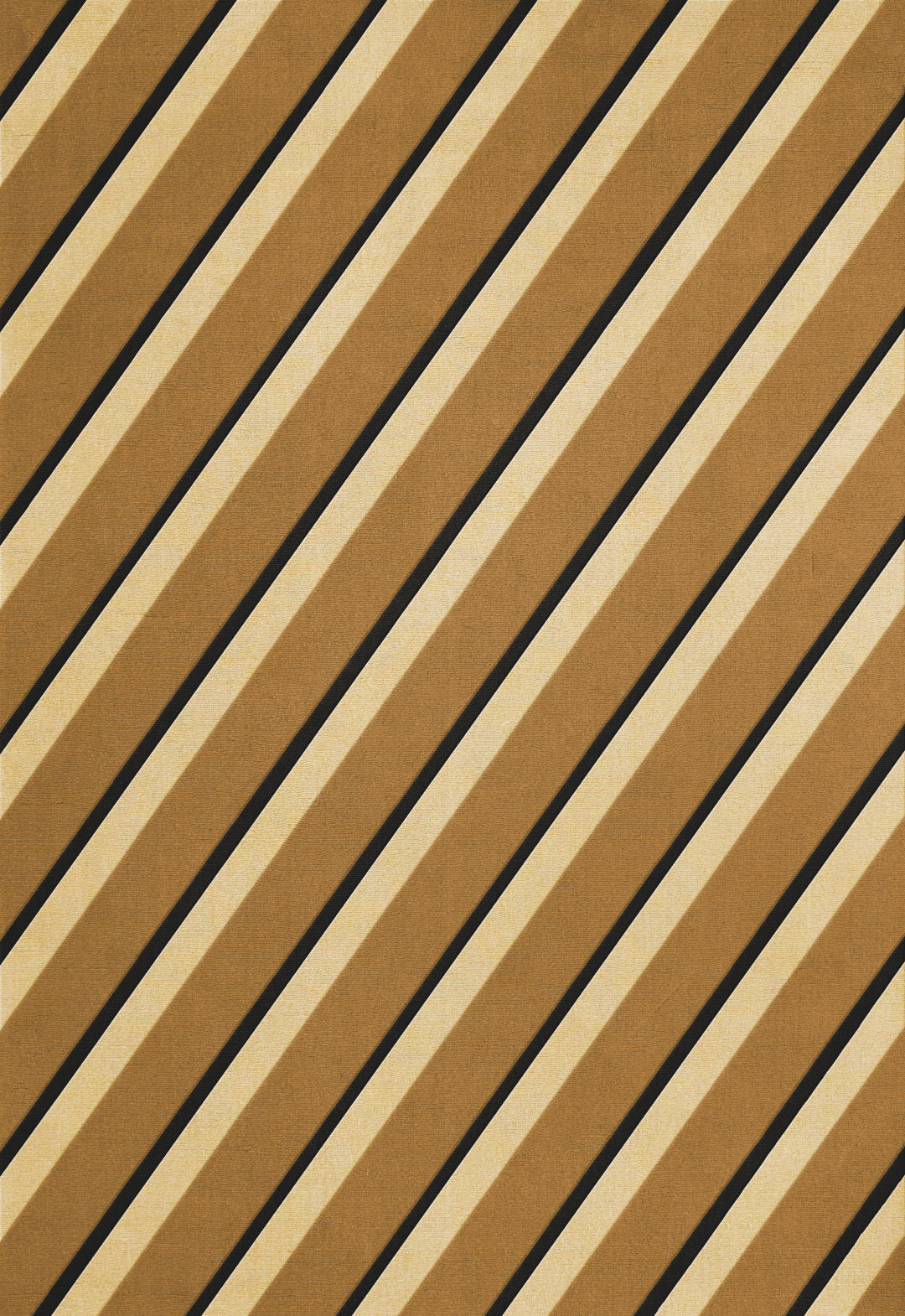
DEN FÖRSTA There is a reason this heavy, mustard-toned earth feels intuitively familiar: it is widely recognized as humanity’s very first pigment. Long before the concept of design even existed, raw ochre was used to leave our earliest conscious marks on the world. We are drawn to its tactile depth because it grounds a space not in mere decoration, but in pure, enduring human instinct
Diagonal, Sand